
This Kindle review is for the 2012 edition of the device, which is controlled by a small number of buttons. The newest basic 'Kindle' is redesigned with a touchscreen. We'll be reviewing that new Kindle in a few days time, hopefully, but for now see our Kindle vs Kindle Paperwhite vs Kindle Voyage to compare all the current models in the line up. Of course if you're looking to pick up the - still rather good - old model secondhand somewhere then read on.
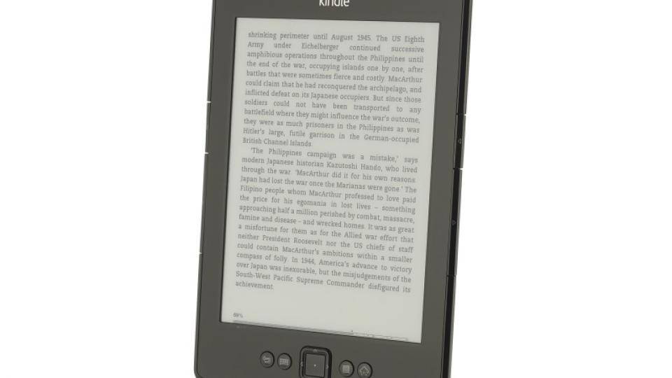
When Amazon introduced its current entry-level eReader a year ago (also called simply the Kindle), it took a minimal approach, removing the keyboard and leaving just a handful of buttons to navigate the menus and turn pages. This didn’t really matter, though, as most Kindle users we know buy almost all their books through the website, rather than via the Kindle itself. The new 2012 model continues the same tried and tested formula, but has a swanky new dark grey finish and, according to Amazon, improved contrast and page turn speeds.
SCREEN
Underneath it’s essentially the same 6in E ink Pearl screen with an 800x600 resolution. This is a slightly lower resolution than the 1,024x768 screen used in the new Kindle Paperwhite , so text isn’t quite as sharp. It’s a small difference though and the Kindle’s screen is very easy to read and text is clearly legible.
The new Kindle has the same E Ink Pearl screen we've seen before, but contrast has been boosted
Claims of improved contrast are certainly accurate and text looked noticeably darker compared to its predecessor. In fact, it was noticeably darker than the same screens used on other eReaders, too. Amazon claims to have sped up page turns by 15 per cent, but we couldn't notice any practical improvement head-to-head. There are still a pair of page-turn buttons on either side of the screen. These are neatly integrated into the bevelled edges and cantilever out slightly as you press them, giving excellent feedback.
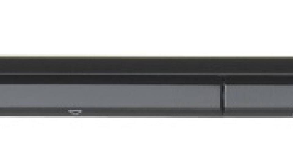
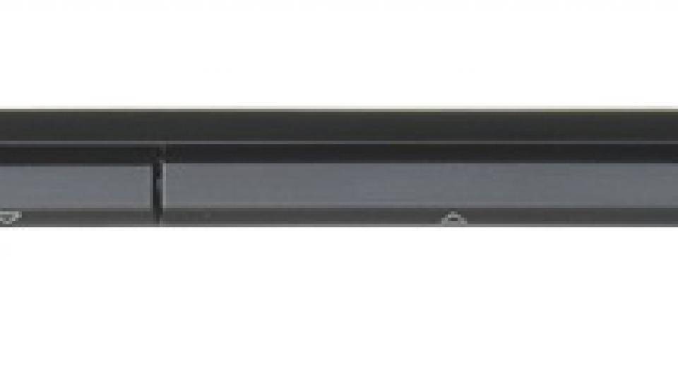
Cantilevered buttons on the side of the screen make turning pages easy and comfortable
By default the eReader is set to perform only a full page refresh after around every six page turns. This increases general speed and helps improve battery life. If you look carefully at the screen you can see that over a few page turns there's a slight build-up of ghost text where it hasn't been fully refreshed. However, this is more noticeable moving from one book to another, rather than staying in the same book. For most normal reading situations you'd be hard pressed to notice it.
INTERFACE
With buttons instead of a touchscreen, the Kindle misses out on the smarter interface of the Kindle Paperwhite. There’s no cover view of your books, but just a text list of titles. It’s easy enough to navigate, though, and as most of your time will be spent in a book, you won’t need to go back to the home screen much.
You can access the full Kindle store to buy books and there’s a dedicated button to bring up the on-screen keyboard. It’s a little fiddly to use, as you need to use the cursor pad to navigate round the keys and press the button to ‘type’ them. As such, this Kindle is best used if you’re going to buy your books via a browser, which most people do, and for the occasional searching of text.
There’s less control over the on-screen fonts, too. There’s a choice of eight font sizes, but only three typefaces (regular, condensed and sans serif). You can also change the line spacing, but you don’t get the full control that you do with the new Paperwhite. That’s not to say that the Kindle presents text badly (it doesn’t), but just that it runs a different version of the OS.

