
Data visualization offers professionals an innovative way to communicate information. Web publishers and journalists, corporate communications services, marketers, and more generally the professionals called upon to make public presentations now make use computer graphics to highlight, popularize and contextualize information. The creation of computer graphics is now also accessible to the uninitiated as many free online tools are available today, to enable them to create professional-looking graphics. Here is a reminder of some best practices and a selection of simple tools to get optimal results.
Getting started
Identify the goal of computer graphics: visually translate complex data, compare or highlight information, identify trends/developments, take stock, etc..all within a single graphics.
Choose a strong theme: what must the computer graphics show or demonstrate?
Focus on simplicity: a common mistake is to overload the computer graphics with information, making it difficult to read in the end. It is therefore important to make a plan and a strict selection of data/items to highlight.
Relying on data from reliable sources (public) to be annotated at the en of computer graphics
Tapping into existing computer graphics: https://coolinfographicom/ contains examples of the popular infographics.
Choose Format: vertical or landscape.
Focus on visual storytelling: the graphical components of computer graphics should be self explanatory.
Finally, remember to rely on existing tools such as Microsoft Excel, which can generate a wide variety of diagrams which can then be integrated to the computer graphics.Mindmapping tools can also be used.
The different types of diagrams
Chronological display
Typically, to illustrate the history, evolution/transformation of a brand, product or problem over time.
Pie charts
To compare the share of budget allocated to certain positions, the share of sectors in an economy, an ecosystem of sale, etc.. financial assets...
Bar charts
To compare percentages in a poll/survey for example.
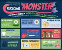
Combined with text, they can answer the question: "What type of user are you? "
Comparative Tables
Ex: To compare the costs of certain commodities, between different countries.
Tree maps
Display different types of approaches.
Flowcharts
To achieve a logical demonstration, a report of cause and effect.
Venn diagrams
Venn diagrams are geometrical patterns (circles) to show the inter-relationships between different several components:
Easel.ly: This online tool provides a range of tools that combine easu text editing, and rapid insertion of icons to enhance your graphics, and facilitate the narration. It also offers various tools for free creations: choice of background colors, insertion of visual objects from different categories (people, maps, animals, etc..), Shapes (arrows, circles), and several stylistic effects .
Many Eyes: This site allows you to download several types of templates.
Hohli: This tool allows you to create, customize and share different types of charts (bar charts, pie charts, etc..)


